
In this example, I am going to use the GSS 2018 data (NORC at the University of Chicago, 2019) to investigate individual’s belief in the afterlife across age group (You may download the dataset from here: https://gss.norc.org/us/en/gss/get-the-data.html).
Importing the Data
First, we need to import the data into R. Because the datasets are only available in SPSS, SAS, or STATA, we will need to install the haven package to read SPSS datafiles. You may read more about the haven package here: https://cran.r-project.org/web/packages/haven/index.html.
library (haven)
gss <- read_sav("your_file_location.spss")
head(gss)
Because the dataset is huge and we are only interested in two variables “AGE” (for age of respondents) and “AFTERLIF” (belief of afterlife), we will extract the data into a separate table for visualisation. You may read more about tidyverse here: https://www.tidyverse.org/
library(tidyverse)
table(gss$AGE, gss$AFTERLIF)
Preparing the Data
To give a little bit of context, respondents were given a likert scale when they were asked about their beleifs in the afterlife. They are rated 0 = “inapplicable”, 1 = “Yes, definitely”, 2 = “Yes, probably”, 3 = “No, probably not”, 4 = “No, definitely not”, 8 = “Don’t know”, 9 = “Not applicable”. Because we are only interested in 1 to 4, and not 0, 8, and 9, we remove them and label the rest of the data accordingly.
The age range of our respondents ranges from 18 to 89. Values above 89 are capped as “89 and older”. In order for better visualization, I will group them.
gss_clean <- gss %>%
  filter(!is.na(AGE), !is.na(AFTERLIF)) %>%
  filter(!(AFTERLIF %in% c(0, 8, 9)), AGE < 98) %>%
  mutate(
    AFTERLIF = factor(AFTERLIF,
                      levels = c(1, 2, 3, 4),
                      labels = c("Yes, definitely", "Yes, probably",
                                 "No, probably not", "No, definitely not")),
    age_group = cut(AGE,
                    breaks = c(17, 29, 39, 49, 59, 69, 79, Inf),
                    labels = c("18–29", "30–39", "40–49", "50–59",
                               "60–69", "70–79", "80+"),
                    right = TRUE)
  )
Now that we have this dataset done, we need to prepare the other items required in our graph. This includes our legend. In our legend, I do not just want to know what each category are. I also want to know the number of respondents and the percentage of respondents who fall into each category. Hence, I’ve created this dataframe called “legend_data”.
legend_data <- gss_clean %>%
  count(AFTERLIF) %>%
  mutate(
    percent = n / sum(n),
    label = paste0(AFTERLIF, " (N=", n, ", ", percent(percent), ")")
  )
Now, to set aside the data that we want to plot, we can create a new dataframe called “plot_data”. The data will be grouped by the afterlife category and their age group which we created above. Finally, we also need to join this with the “legend_data” which we have just created.
plot_data <- gss_clean %>%
  group_by(age_group, AFTERLIF) %>%
  summarise(freq = n(), .groups = "drop") %>%
  left_join(legend_data, by = "AFTERLIF")
For pure aesthetics, I would like to see the total N per age group shown at the top of my graph. To do this, I will need to create a “totals” dataframe for it.
totals <- plot_data %>%
  group_by(age_group) %>%
  summarise(total = sum(freq))
Take note of these two datasets: plot_data and totals. You’ll see it later.
Visualizing the Data with GGPLOT2
Finally, we can start drawing the visuals. In this exercise, we are using the ggplot function from within the ggplot2 package. (For more info, you may view: https://ggplot2.tidyverse.org/). This is the full code:
ggplot(plot_data, aes(x = age_group, y = freq, fill = label)) +
  geom_bar(stat = "identity", position = "stack") +
  geom_text(aes(label = freq), position = position_stack(vjust = 0.5), size = 3, color = "white") +
  geom_text(data = totals, aes(x = age_group, y = total, label = paste0("N=", total)),
            vjust = -0.5, inherit.aes = FALSE, size = 3.5) +
  labs(
    title = "Belief in the Afterlife by Age Group",
    x = "Age Group",
    y = "Number of Respondents",
    fill = "Belief in Afterlife"
  ) +
  theme_minimal() +
  theme(axis.text.x = element_text(angle = 45, hjust = 1))
It’s a lot. I know. So, here’s the breakdown:
ggplot(plot_data, aes(x = age_group, y = freq, fill = label))
ggplot(): This is the function that starts your visualisation.plot_data: This is the data frame you’re using for your chart.aes(): This stands for aesthetics – it tells R what goes where. In context, it tells R what is the x-axis, y-axis, and colours to use:x = age_group→ the x-axis will show age bands (like “18–29”, “30–39”)y = freq→ the y-axis will show how many people (the count/frequency)fill = label→ different belief categories (like “Yes, definitely”) will be shown in different colors based onlabel.
geom_bar(stat = "identity", position = "stack")
geom_bar()is the function for making bar plots.stat = "identity"→ you’re telling R to use the exacty-values (frequency) from the data rather than counting things themselves.position = "stack"→ stack the bar segments on top of each other. So each age group has one bar, split into colored chunks by belief category.
geom_text(aes(label = freq), position = position_stack(vjust = 0.5), size = 3, color = "white")
This adds labels inside each bar segment.
aes(label = freq)→ use thefreqvalue as the text label.position_stack(vjust = 0.5)→ stack the labels just like the bars, but center them vertically in each segment.vjust = 0.5→ vertical justification (0 = bottom, 0.5 = center, 1 = top).size = 3→ font size of the labels.color = "white"→ white text to contrast nicely against the colored bars.
geom_text(data = totals, aes(x = age_group, y = total, label = paste0("N=", total)), vjust = -0.5, inherit.aes = FALSE, size = 3.5)
This adds a label above each full bar showing the total number of respondents in each age group.
Let’s unpack it:
data = totals→ we’re now using a different dataset (notplot_data) that has one row per age group, with atotalcolumn.aes(x = age_group, y = total, label = paste0("N=", total)):x= which bar to place the label ony = total→ how high up to place itlabel = paste0("N=", total)→ makes the label say things like “N=130”
vjust = -0.5→ pushes the text a little above the top of the barinherit.aes = FALSE→ don’t use the aesthetics from the mainggplot()(we want to manually define them here)size = 3.5→ slightly larger font size
labs(...) Also known as “Labels”
This sets the titles and axis/legend labels:
title = "Belief in the Afterlife by Age Group"→ the main title of the chartx = "Age Group"→ label below the x-axisy = "Number of Respondents"→ label beside the y-axisfill = "Belief in Afterlife"→ label for the legend (which usesfillto color)
theme_minimal()
This is a theme preset that makes the chart look clean and modern by:
- removing background gridlines
- using simple fonts
- minimizing distractions
theme(axis.text.x = element_text(angle = 45, hjust = 1))
This just rotates the x-axis labels:
angle = 45→ turns the labels 45 degreeshjust = 1→ aligns the text to the right (so it doesn’t overlap)
Useful when you have long or many category names like “60–69”, “80+”, etc.
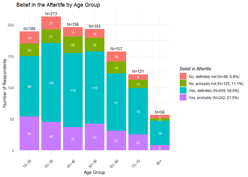
Final Visualisation
Congratulations for being able to make it this far! The graph that you’ll get should resemble the one below. Hope you learn a thing or two about R!
Feel free to download my reference R script here.

Leave a comment