Before any analysis is done, it is the job of the data analyst to ensure that the data is ready. In this post, we will look into how we can do that with R.

First, we need to identify the type of data we are looking at before any form of preparation is done. Generally, there two main types of data — (1) continuous and (2) categorical. Continuous data are data that are numerical in nature. Categorical data on the other hands are data that can be split into multiple categories. Examples of data that fall within this category are gender and ethnicity.
These two groups can be further grouped into nominal, ordinal, interval, or ratio data. However, I will not get to that in this post.
Determining the type of data is essential because it lays the ground works for what should you check for moving forward. In this example, I will be using the mental health lifestyle and habits dataset by Atharva Soundankar. You may download this on Kaggle via this link: https://www.kaggle.com/datasets/atharvasoundankar/mental-health-and-lifestyle-habits-2019-2024.
Note: This dataset is constantly being updated. The version I am currently using is the one I’ve downloaded on the 21st March, 2025.
Once you have downloaded your dataset, you may proceed to open your R workspace and import your dataset. My personal habit is to setup my working directory so that I do not have to type the full directory of the filepath.
# Set your working directory
setwd("...Downloads/rpractice")
# Import the dataset
mentalhealth <- read.csv("mentalhealth.csv", stringsAsFactors = FALSE)
Determining Data Type
Once you have imported your data, the next thing we can do is to use the structure command to inform us of the internal structure of the data. Because we have saved the dataset into a dataframe called “mentalhealth”, our code for the structure is simply “str(mentalhealth)”.
str(mentalhealth)Once we have done that, the console will return us the following.
> str(mentalhealth)
'data.frame':	3000 obs. of  12 variables:
 $ Country                    : chr  "Brazil" "Australia" "Japan" "Brazil" ...
 $ Age                        : int  48 31 37 35 46 23 49 46 60 19 ...
 $ Gender                     : chr  "Male" "Male" "Female" "Male" ...
 $ Exercise.Level             : chr  "Low" "Moderate" "Low" "Low" ...
 $ Diet.Type                  : chr  "Vegetarian" "Vegan" "Vegetarian" "Vegan" ...
 $ Sleep.Hours                : num  6.3 4.9 7.2 7.2 7.3 2.7 6.6 6.3 4.7 3.3 ...
 $ Stress.Level               : chr  "Low" "Low" "High" "Low" ...
 $ Mental.Health.Condition    : chr  "None" "PTSD" "None" "Depression" ...
 $ Work.Hours.per.Week        : int  21 48 43 43 35 50 28 46 33 44 ...
 $ Screen.Time.per.Day..Hours.: num  4 5.2 4.7 2.2 3.6 3.3 7.2 5.6 6.6 7.7 ...
 $ Social.Interaction.Score   : num  7.8 8.2 9.6 8.2 4.7 8.4 5.6 3.5 3.7 3 ...
 $ Happiness.Score            : num  6.5 6.8 9.7 6.6 4.4 7.2 6.9 1.1 5.2 7.7 ...
This output tells us that within the mental health dataframe, there is a total of 3000 observations (or rows of data) with 12 differrent variables. The variables are listed in the output. The data type is shown after the colon in a three-characters abbreviation.
| Abbreviation | Description |
| chr | Characters — Normally text data / string. |
| int | integers – Numbers with no decimal places |
| num | Numbers with decimal places |
The values on the right of the abbreviation then give us a preview of what the data looks like.
Checking for Missing Data
Next, we want to find out if there is any missing values within the data. Missing values are cells that are empty within the dataset. We will use this code to identify them.
sum(is.na(mentalhealth))Note: It is important to note that sometimes missing values are coded differently. For example, if the data analyst before you uses certain softwares such as MPlus, missing values are generally not allowed. As such, they will need to be recoded with an arbiturary code such as “999”. These code(s) can normally be found in the data codebook.
In our case, the data is not coded as anything and there is no missing value as evident by our output.
> sum(is.na(mentalhealth))
[1] 0
Check Observations of Categorical Variables
The next step is solely for categorical variables. In order to ensure that we have an even spread of data for all categorical variables, we will need to count the number of observations accordingly. It will be wrong to do an analysis when the spread isn’t proportionate (e.g. 95% male and 5% female). For a representative analysis, all categories should be sufficiently represented. If not for a 50-50 representation, it should at least be as close to the general population as possible for the results to be representative. This is the code I use.
library(dplyr)

# Automatically find character or factor columns
categorical_vars <- mentalhealth %>%
  select(where(~ is.character(.x) || is.factor(.x)))

# Get count summary for each categorical variable
for (var in names(categorical_vars)) {
  cat("\n---", var, "---\n")
  print(table(categorical_vars[[var]], useNA = "ifany"))
}
Using this code, I will be able to know the number of observations for each category within each categorical variable. And based on the output, it looks like we have got a pretty equal representation across the board.
--- Country ---
Australia    Brazil    Canada   Germany     India     Japan       USA
      434       415       428       404       434       439       446

--- Gender ---
Female   Male  Other
  1024    980    996

--- Exercise.Level ---
    High      Low Moderate
     969     1033      998

--- Diet.Type ---
  Balanced  Junk Food       Keto      Vegan Vegetarian
       625        637        573        573        592

--- Stress.Level ---
    High      Low Moderate
    1002     1008      990

--- Mental.Health.Condition ---
   Anxiety    Bipolar Depression       None       PTSD
       628        573        580        595        624
Summary of Continuous Variables
Next, what you would want to do is generate a summary of all the continuous variables within the dataset. These include minimum, 1st quartile, median, mean, 3rd quartile, and maximum.
mentalhealth %>%
  select(where(is.numeric)) %>%
  summary()
The output should look something like that.
Based on the summary output, we kind of already know what is the data we are dealing with. Examining the minimum and maximum values, the scored variables seem to be on a scale of 1 to 10. Screen time use ranges from 2h to 8h per day. Work hours per week range from 20h to 59h per week. Sleep hours range from 1.4h per day (a little low in my opinion) to 11.3h per day (I envy this guy). And the age ranges from 18 years old to 64 years old. All the data except the sleep hours looks pretty normal to me at first glance. But it doesn’t tell us how the data looks. For example, if I were to plot a distribution curve, I will not know if this is a unimodal distribution or a multimodal one. I will also not know if this is a normal curve or a skewed curve. To do this, I will need to calculate skewness and kurtosis.
Distribution of Continuous Data
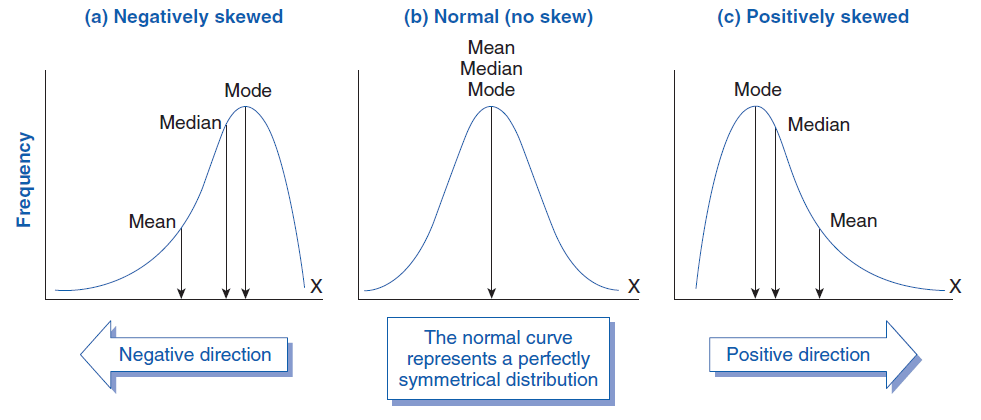
Skewness tells you whether your data is symmetric or lopsided (i.e., if one tail is longer than the other). Kurtosis, on the other hand, measures the “tailedness” or peakiness of a distribution. It tells you how extreme the outliers are and whether the distribution is too flat or too peaked compared to a normal distribution. We examine the skewness and kurtosis values using this as a guide.
| Skewness Value | Meaning | Shape |
|---|---|---|
| ≈ 0 | Symmetric (like normal curve) | Bell-shaped |
| > 0 | Positively skewed (right tail) | Long tail to the right |
| < 0 | Negatively skewed (left tail) | Long tail to the left |
| > ±1 | Highly skewed (non-normal) | May need transformation |
| Kurtosis Value | Meaning | Shape |
|---|---|---|
| ≈ 3 | Normal (mesokurtic) | Standard bell shape |
| > 3 | Leptokurtic (peaked, heavy tails) | High peak, more outliers |
| < 3 | Platykurtic (flat, light tails) | Flatter, fewer outliers |
The code I use to generate skewness and kurtosis values are as follows.
# Select numeric variables
num_vars <- mentalhealth %>%
  select(where(is.numeric))

library(moments)
skewness(num_vars, na.rm = TRUE)
kurtosis(num_vars, na.rm = TRUE)
Using this code, it automatically selects all continuous (numeric) variables and calculate the skewness and kurtosis accordingly. The data is as follows.
> skewness(num_vars, na.rm = TRUE)
                        Age                 Sleep.Hours         Work.Hours.per.Week Screen.Time.per.Day..Hours.
               -0.005811482                -0.019011922                 0.009919695                -0.074033318
   Social.Interaction.Score             Happiness.Score
                0.021085004                 0.031144033
> kurtosis(num_vars, na.rm = TRUE)
                        Age                 Sleep.Hours         Work.Hours.per.Week Screen.Time.per.Day..Hours.
                   1.838820                    2.921448                    1.788324                    1.798430
   Social.Interaction.Score             Happiness.Score
                   1.838137                    1.827120
Based on the values, the skewness are all close to 0, telling us that the data resembles a normal curve. The kurtosis are mainly lesser than 3, informing us that the data are all looking pretty flat with the exception of sleep hours.
Visualize all Continuous Variables using Histograms
To help us gain a better insight to the data, let’s visualize it using histograms. To do this, we will need to use the package ggplot2 (Refer to this for more information: https://ggplot2.tidyverse.org/).
The code I will be using is as follows.
library(ggplot2)
library(dplyr)
library(tidyr)

# Reshape data into long format
num_long <- num_vars %>%
  pivot_longer(cols = everything(), names_to = "Variable", values_to = "Value")

# Plot histograms using facets
ggplot(num_long, aes(x = Value)) +
  geom_histogram(fill = "skyblue", color = "white", bins = 30) +
  facet_wrap(~ Variable, scales = "free", ncol = 3) +
  theme_minimal() +
  labs(
    title = "Histograms of All Continuous Variables",
    x = "Value",
    y = "Frequency"
  )
Having already selected the numerical values, I first reshape the data into long format before using ggplot to plot my histogram. Below is my output.
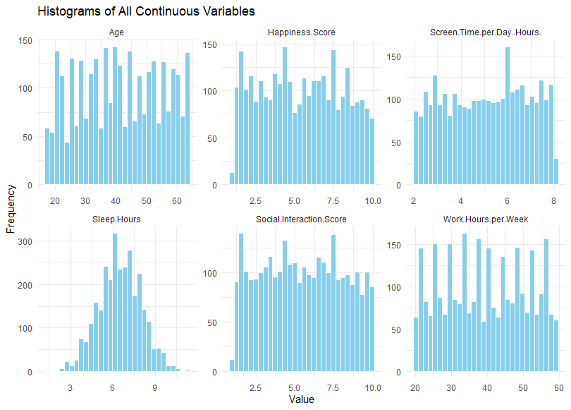
Using these histogram, we can visually check the distributions to see if they are normal. If the data is normal, it should be shaped like a bell. And in this case, only the sleep hours appear like a normal distribution. For the rest of the data, further transformation and exploration might be required before we begin any analysis. To determine what else to do, we should ask whether non-normality is a problem.
Is non-normality an issue?
There are cases where non-normality is not an issue. For example, if the data show a normal distribution for “age”, then we know that the bulk of the respondents will be close to the mean. In this hypothetical scenario, the data does not seem representative. However, in our case, it appears that the respondents are equally distributed across all ages. That meant that there all age groups are equally represented in our sample, increasing our representativeness of the data. Hence, we know that it is okay for the “age” variable to be non-normal. The same might be said for work hours. However, we would expect it to be negatively skewed (skewed towards the higher end) because we would expect more people to have a full-time job with approximately higher than 40 hours of work per week. But that’s just an assumption.
Essentially, we need to dive into the root of the data to determine, one-by-one, whether or not non-normality is an issue. And if it is an issue, then we will need to conduct further tests to determine normality.
Further Test for Normality
One comon test we can use to test for normality is the Shapiro-Wilk Test. For the Shapiro-Wilk test, the null hypothesis refers to a normal data. Hence, if the p-value is significant (p < .05), then we should reject normality. You can call the shapiro test using the code “shapiro,test” in R. Our result is as follows.
> shapiro.test(mentalhealth$Screen.Time.per.Day..Hours.)

	Shapiro-Wilk normality test

data:  mentalhealth$Screen.Time.per.Day..Hours.
W = 0.95306, p-value < 0.00000000000000022
In our case above, we reject normality for screen time.

Leave a comment