A dataset isn’t just a spreadsheet of numbers — it’s a story waiting to be uncovered. As data analysts, our job is to make sense of that story by identifying patterns, relationships, and signals within the noise. But without a reference point, knowing where to begin can feel overwhelming. That’s where correlation analysis comes in. It offers a visual, statistical snapshot of how different variables are connected — highlighting relationships we might expect (like love and commitment), and surfacing ones we might not (like income and confidence).
In this post, we’ll use the Marriage and Divorce dataset (Mousavi, MiriNezhad, & Lyashenko, 2017) to walk through how to conduct a correlation analysis and build a heatmap in R. It’s a simple but powerful tool to help us grasp what the data is trying to say — even before we build models or test hypotheses.
You can find the dataset on Kaggle here: Marriage and Divorce Dataset on Kaggle
What’s Correlation?
At its core, correlation is about understanding how two variables move together. It answers the simple but powerful question:
“When one variable increases, what tends to happen to the other?”
This foundational concept in statistics is often one of the first tools we turn to in exploratory data analysis (EDA) — and for good reason. Before any modeling or hypothesis testing, correlation helps us:
- Detect relationships and uncover patterns in the data
- Identify multicollinearity, which occurs when two or more predictors in a model are highly correlated — potentially inflating errors
- Guide feature selection by revealing redundant or uninformative variables
- Provide directional insight — does the data suggest a positive or negative trend?
By visualizing these relationships in a matrix or heatmap, we move one step closer to transforming raw data into actionable understanding.
The most commonly used correlation coefficient is the Pearson correlation coefficient (denoted as r). It quantifies the linear relationship between two variables and ranges from −1 to +1. The formula for Pearson’s r is:
Using the r value from Pearson’s r, we can derive the relationship between two variables.
| r Value | Interpretation |
|---|
| 1.00 | Perfect positive linear correlation |
| 0.70 to 0.99 | Strong positive correlation |
| 0.30 to 0.69 | Moderate positive correlation |
| 0.01 to 0.29 | Weak positive correlation |
| 0.00 | No correlation |
| −0.01 to −0.29 | Weak negative correlation |
| −0.30 to −0.69 | Moderate negative correlation |
| −0.70 to −0.99 | Strong negative correlation |
| −1.00 | Perfect negative linear correlation |
It is important to remember that correlation ≠ causation. A strong correlation might hint at a relationship, but it doesn’t prove that one variable causes the other.
Squaring the r value will give us the R² (coefficient of determination). This is the proportion of variance explained. For example, if the R² value for an analysis is 0.25, then we know that 25% of the variance is explained.
What’s the difference between Pearson and Spearman?
Both Pearson and Spearman correlations are used to measure associations between variables, but they differ in what kind of relationship they detect and the assumptions they make.
| Metric | Pearson | Spearman |
|---|
| Measures | Linear relationships | Monotonic relationships (increasing or decreasing) |
| Data Type | Interval or ratio (continuous) | Ordinal, interval, or non-normally distributed data |
| Assumes | Normally distributed variables | No assumptions about distribution |
| Method | Uses actual values | Uses ranked values |
In other words, Pearson should be used when you expect a linear relationship and your data is continuous and approximately normal. while Spearman should be used when your data is skewed, ordinal, or you suspect a nonlinear but consistent trend.
Running Correlation in R
As always, it is important to set your working directory and import the dataset which you would want to work on.
# Set your working directory
setwd("...Downloads/rpractice")
# Import the dataset
love <- read.csv("Marriage_Divorce_DB.csv", stringsAsFactors = FALSE)
Next, we can use a simple code to call out the correlation matrix. The matrix will be shown in your R console. The size of the matrix will be dependent on the size of your dataset.
cor_matrix <- cor(love, use = "pairwise.complete.obs")
round(cor_matrix, 2)
This particular line does not need any special R packages. It uses the base R functions of cor() that computes the correlation matrix.
The line use = "pairwise.complete.obs" tells R to calculate the correlation for each variable pair using only the rows where both variables are not missing.
Note: The correlation matrix here does not compute p values like other statistical softwares like SPSS or Jamovi.
Visualising Individual Correlation
Individual Correlations can be visualised using a scatterplot. In a scatterplot, we plot individual responses on a matrix where each variable is on an axis. Then, we draw the best fit line across it. It should look like this.
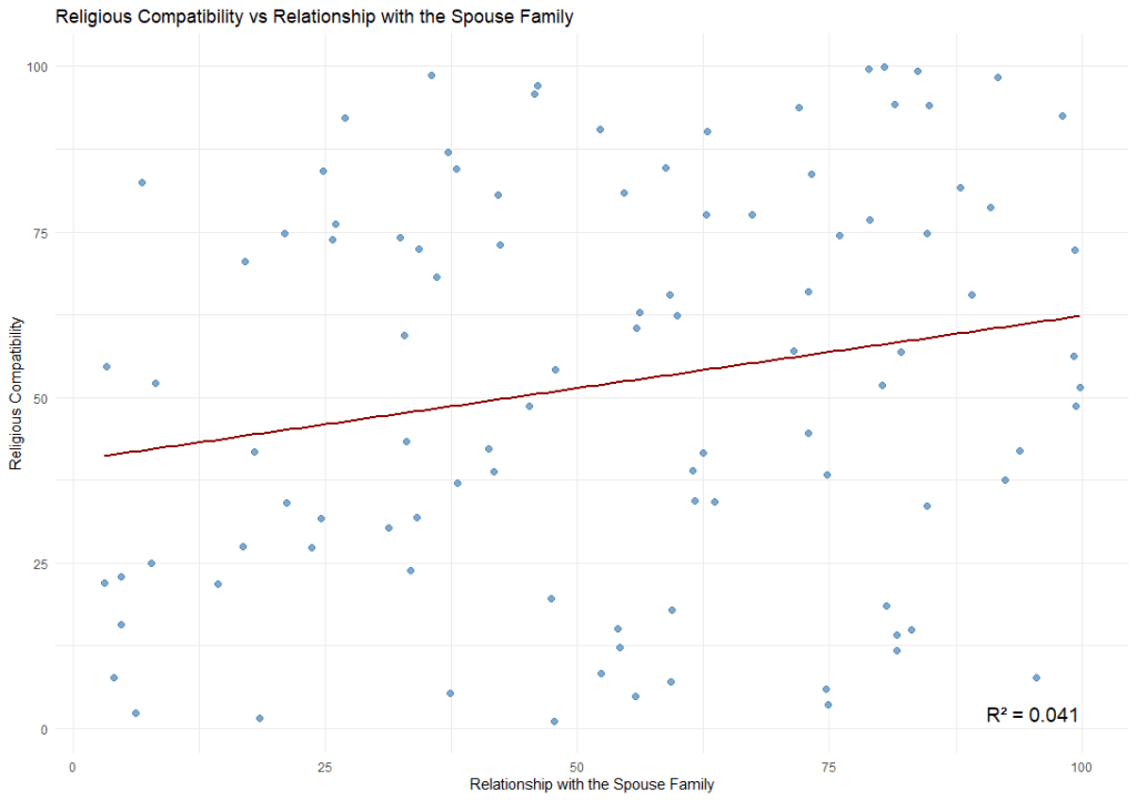
We can achieve this using the ggplot function (you will need to load the ggplot2 package in order to use this function). The code is as follows:
# Fit the correct model
model <- lm(Religion.Compatibility ~ Relationship.with.the.Spouse.Family, data = love)

# Extract R²
r2 <- summary(model)$r.squared
r2_label <- paste0("R² = ", round(r2, 3))

# Plot (matching the model!)
ggplot(love, aes(x = Relationship.with.the.Spouse.Family, y = Religion.Compatibility)) +
  geom_point(color = "steelblue", size = 2, alpha = 0.7) +
  geom_smooth(method = "lm", color = "darkred", se = FALSE) +
  annotate("text", x = max(love$Relationship.with.the.Spouse.Family),
           y = min(love$Religion.Compatibility),
           label = r2_label, hjust = 1, vjust = 0, size = 5) +
  theme_minimal() +
  labs(title = "Religious Compatibility vs Relationship with the Spouse Family",
       x = "Relationship with the Spouse Family",
       y = "Religious Compatibility")
By default, ggplot only plot the regression line when we use geom_smooth(method = “lm”). Therefore, for visualisation purposes, if you require the R² , then it should be calculated the R² separately.
There are generally two types of correlation results. Positive or negative.
- A positive correlation refers to a positive increase in both variable.
- A negative correlation refers to a positive increase in one variable but a decrease in another.
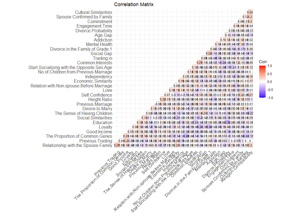
Visualising Correlation on a Heatmap
In order to have a birds’ eye view of the dataset, we would want to see how different variables within the dataset correlate with one another. To do that, we can plot it on a heatmap. A heatmap is essentially just a table on a matrix where the values (in this case, the r values) are highlighted on a scale so that we can easily see which are positively correlated and which are negatively correlated. We can do this using this code.
ggcorrplot(cor_matrix, hc.order = TRUE, type = "lower",
           lab = TRUE, lab_size = 3,
           colors = c("blue", "white", "red"),
           title = "Correlation Matrix",
           ggtheme = theme_minimal())
Note: In order to run this code, you will need to install the pacakge called “ggcorrplot”.
What this code does is essentially to draw a matrix with all the variables in the dataset in both the x-axis and the y-axis. Then it plots the r value on the intersection of each variables. Next, it uses the palette (in this case, “blue”, “white”, and “red”), to highlight the relationship between the variables.
Highlighting the items that are significant
Remember how I mentioned that this heatmap shows all correlation regardless whether they are significant or not? To hide items that are not significant (p values > .05), we will need to tweak our code a little.
# Visualize with significance masking
ggcorrplot(r_matrix,
           p.mat = p_matrix,
           sig.level = 0.05,    # mask correlations with p > .05
           insig = "blank",     # hide insignificant
           type = "lower",
           lab = TRUE,
           title = "Correlation Matrix (Significant Only)",
           colors = c("blue", "white", "red"),
           ggtheme = theme_minimal())

# Get a logical matrix where p < 0.05
sig_mask <- p_matrix < 0.05

# Replace diagonal with FALSE to ignore self-correlation
diag(sig_mask) <- FALSE

# Identify variables (columns) with at least one significant correlation
vars_to_keep <- apply(sig_mask, 2, function(col) any(col, na.rm = TRUE))

# Filter both matrices
filtered_r <- r_matrix[vars_to_keep, vars_to_keep]
filtered_p <- p_matrix[vars_to_keep, vars_to_keep]
What this code does is create a data frame where p < .05. Then we replace them with the value “FALSE”. Once done, we create a new dataframe called “vars_to_keep” by retaining only values that are significant. Using that, we plot our new correlation matrix.
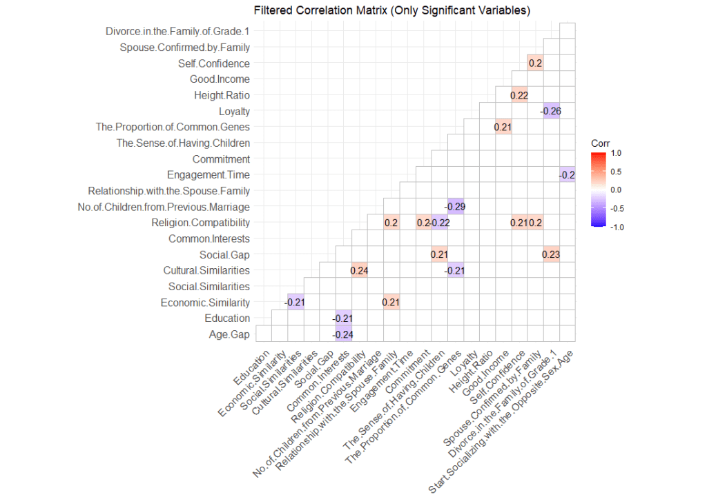
With this matrix, we have a clearer picture of what variable is significantly related to one another. The heatmap also gives us an overview of the characteristics of the correlation.

Leave a comment