Say for example you have developed a brand new questionnaire that no one has used before. You designed it to measure an abstract construct, but you are unsure if the questionnaire is valid statistically. What would you do?
This is where exploratory factor analysis (EFA) comes in. EFA is a statistical technique used when you don’t yet know the underlying structure of your scale. It helps you uncover how many constructs (factors) your items are tapping into, and which items cluster together. Think of it as letting the data “speak for itself” — you’re exploring the hidden patterns without imposing any pre-existing theory or structure.
EFA is your first stop when validating an instrument. For example, a questionnaire might be designed to measure three different psychological traits. However, the EFA might reveal only two clear groupings of items (or even more than three!). That insight is critical. It tells you how your items behave in reality, not just in theory.
When conducting an EFA, you will need to consider a few factors:
- How many factors to extract? (you will need to examine the eigenvalues, scree plot, or parallel analysis)
- What rotation to use? (e.g., oblimin if you expect factors to be correlated, varimax if not)
- Which items load strongly onto which factors? (typically, loadings > .40 are considered meaningful)
- Do any items cross-load or not load at all? (if so, they may need to be dropped or revised)
Conducting the EFA in R
In this example, we will use the GSS “Welfare Issue” dataset (Smith et al., 2023). The questions are as follows:
- welfare1 — welfare makes people work less
- welfare2 — helps people overcome difficult times
- welfare3 — encourages out-of-wedlock children
- welfare4 — preserves marriages in difficult times
- welfare5 — helps prevent hunger and starvation
- welfare6 — discourages pregnant girls from marrying
First, load the dataset into R and select the variable of interest. Use the “haven” package to load SPSS datasets into R.
setwd(".../Downloads/rpractice")
install.packages("haven")
library(haven)
data <- read_sav("GSS7218_R3.sav")
library(dplyr)
welfare <- data %>%
  dplyr::select(ID, YEAR, WELFARE1:WELFARE6)
Next, install and load the following packages that are required for EFA.
install.packages(c("psych", "nFactors", "GPArotation"))
library(psych)
library(nFactors)
library(GPArotation)
Preparing the dataset
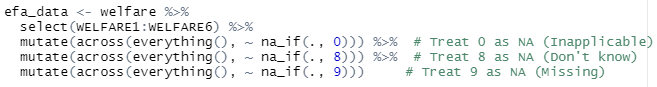
Once done, the next step is to prepare the dataset. The data is coded on a 4-point likert scale (1 = Strongly agree to 4 = Strongly disagree). However, the data is also coded with error values such as 0 for ‘inapplicable’, 8 for ‘don’t know’, and 9 for ‘don’t know’. As such, we should pre-clean the data to remove all invalid values and retain values of interest.
Ensure EFA Suitability by doing a Correlation
Next, we run a correlation to determine whether or not the data is suitable for EFA. EFA assumes that the variables are intercorrelated because we wanted to find similarities between them to determine its constructs. Therefore, we want to determine if the variables are related enough to form factors. On another hand, we are also checking for high correlation (to prevent multicollinearity). A sweet spot is around r = .3 to r = .8.
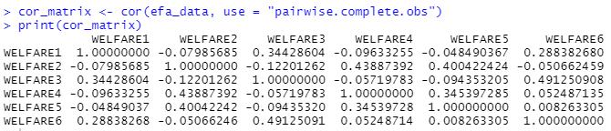
Based on the correlation matrix, our data seem to be okay despite a few low values. The threshold for acceptance is how the variables correlated with the others. For instance, even though welfare4 correlates poorly with welfare 1, welfare 3, and welfare 6, it is still correlating within the acceptable range with welfare2 and welfare5, hinting at a possible construct hiding within the data. Therefore, it is acceptable to proceed with the EFA.
KMO and Bartlett’s
Some data analyst might want to conduct an additional Kaiser-Meyer-Olkin (KMO) test or Bartlett’s Test of Sphericity before their EFA as an additional safeguard. KMO tests the suitability of the data for factor analysis by looking at the strength and consistency of the correlation. The interpretation is as follows:
- > .90 = superb
- .80–.89 = great
- .70–.79 = good
- .60–.69 = mediocre
- < .60 = poor
Bartlett’s Test of Sphericity examine whether or not the dataset is an identity matrix (i.e. no correlation between variables). If any variable is close to an identity matrix, then the EFA wouldn’t work as there isn’t any shared variance to explain. A good result for the Bartlett’s Test of Sphericity is a significant p value that shows that the variables are correlated.
Parallel Analysis
Next, we perform a parallel analysis. To understand this, we need to take things back a notch and look at eigenvalues.
In factor analysis, each eigenvalue represents the amount of variance in your data that is accounted for by a factor. Think of it like this:
If your data is a pie (total variance), then each eigenvalue is a slice of that pie, showing how much each factor contributes.
- A higher eigenvalue means the factor explains more variance.
- If an eigenvalue is less than 1, that factor explains less variance than one original variable — usually not worth keeping.
Now, a scree plot is a line graph of the eigenvalues sorted from largest to smallest. Normally, a scree plot starts with a steep drop on the left and it flattens out on the right. The “elbow” of the plot (normally identified as the point where it starts to level off) as a threshold to determine how many factors to keep.
To conduct the parallel analysis, we run this code:
fa.parallel(efa_data, fa = "fa", n.iter = 100, show.legend = TRUE)The fa = "fa" tells R to use the factor analysis function while the n.iter function tells R the number of simulations it should do to generate random data.
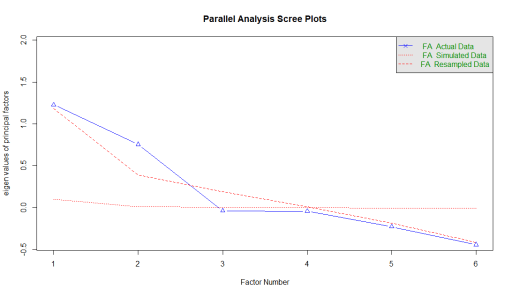
There are three types of data in the parallel analysis: (1) actual data, (2) simulated data, and (3) resampled data. Actual data are the real eigenvalues generated using the dataset. Simulated data are from datasets with the same number of variables and cases, but where the data is random (no real structure). Finally, resampled data are eigenvalues from resampled versions of your original data (e.g., bootstrapping or permutation).
The rule of thumb is to keep the factors where the actual eigenvalues (actual data) are above the red lines (simulated and resampled data). The logic is this — when we try to identify patterns, we need a benchmark. And the benchmark is derived from random data (simulated data) or resampled data. For factors that are above the red lines, it explains more variance than expected by chance. Therefore, we can safely assume that these factors are likely the better representation of true latent constructs.
Interpreting the Results
Now that we have identified that the data contains two latent factors, it is time to generate the actual EFA results. We do this by using one simple line.

fa calls the factor analysis function. nfactors tell R that we have identified 2 factors. In this example, we use the maximum likelihood estimation to find the factor solution that makes your observed data most probable under the assumed factor model. We used maximum likelihood because we assume normality. If the data is not normal, then principal axis factoring might be a better option.
In this example we also used the oblique rotation because we assume factors are correlated. If the assumption is that the data is not correlated, then an orthogonal rotation might be more suitable.
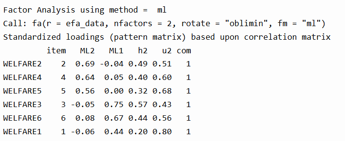
Once you’ve extracted and rotated your factors, the next step is interpreting your factor loadings. These tell you how strongly each item relates to a factor.
We can see that WELFARE2, WELFARE4, and WELFARE5 load on Factor ML2, while WELFARE3, WELFARE6, and WELFARE1 load more strongly on Factor ML1. The values in the h2 column (communality) show how much variance in the item is explained by the factors. For instance, WELFARE2 has a communality of 0.49, meaning 49% of its variance is explained by the factors. The u2 column is the uniqueness (i.e., the portion not explained). The com (complexity) is 1 for all items, which is ideal—it means each item loads cleanly on only one factor.
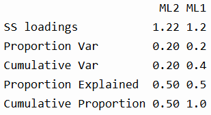
In the summary section, we see that each factor explains about 20% of the total variance, and together they explain 40%. The “Proportion Explained” refers to the relative contribution of each factor to the overall factor solution (in this case, 50-50 split).
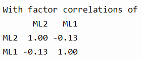
The correlation for the two factors indicate that they are slightly negatively correlated, justifying the use of an oblique rotation like "oblimin".
Model Fit Indices

Below are the interpretation of the model fit indices:- RMSEA = 0.05: This is the Root Mean Square Error of Approximation. Values ≤ 0.05 indicate a close fit, and yours falls right at that sweet spot.
- TLI = 0.957: The Tucker-Lewis Index assesses model reliability. Values > 0.90 are considered good, and yours is excellent.
- BIC = 617.98: The Bayesian Information Criterion helps compare models. Lower values are better, but BIC is mainly useful when comparing multiple models.
- RMSR = 0.02: The residual error between the reproduced and observed correlations. Lower is better; < 0.05 is considered good.
- Empirical χ² (p < .022) and Likelihood χ² (p < .000): These show that the model fits significantly better than a null model, though large sample sizes often make p-values overly sensitive.
- Factor score adequacy: The correlations between factor scores and actual factors were strong (0.82 and 0.84), and the R² values (0.68, 0.70) show good predictability.
You can use factor scores to estimate how strongly each respondent aligns with each underlying factor, also known as latent constructs. These scores are standardized, typically with a mean of 0 and standard deviation of 1, so they allow you to meaningfully compare individuals or groups. In this analysis, two factors were extracted—ML1 and ML2—each representing a different pattern of response to the welfare-related questions.
Since the survey used a 1 to 4 Likert scale, where 1 = strongly agree and 4 = strongly disagree, it’s important to remember that lower raw scores reflect stronger agreement.
Based on the factor loadings:
- ML1 includes high loadings from WELFARE3 (“encourages out-of-wedlock children”), WELFARE6 (“discourages pregnant girls from marrying”), and WELFARE1 (“welfare makes people work less”).
- These items appear to reflect a critical or moralistic view of welfare—concerned with welfare’s negative social consequences or its potential to undermine traditional values.
- So, a high factor score on ML1 likely indicates that a respondent tends to disagree less (i.e., agree more) with such critical statements about welfare.
- ML2 includes strong loadings from WELFARE2 (“helps people overcome difficult times”), WELFARE4 (“preserves marriages in difficult times”), and WELFARE5 (“helps prevent hunger and starvation”).
- These items reflect a supportive or humanitarian perspective on welfare—emphasizing welfare’s role in helping people survive and maintain stability.
- A high factor score on ML2 suggests that a respondent is more likely to disagree with supportive statements about welfare, whereas a low ML2 score reflects stronger agreement and a more supportive attitude.
Now that we have identified these factor scores, we can then use it in further analysis—such as comparing attitudes across demographic groups, tracking trends over time, or including them in regression models to predict voting behavior, policy preferences, or other outcomes.
Concluding Thoughts
In conclusion, Exploratory Factor Analysis (EFA) is more than a statistical routine—it’s a process of discovery. It helps you make sense of patterns in your variables, reduce complexity, and uncover latent dimensions that aren’t directly measurable. From checking data suitability, using tools like parallel analysis, to interpreting factor loadings and model fit—EFA provides a structured, evidence-based way to understand the constructs hidden beneath the surface of your data. Done right, it turns abstract patterns into meaningful insights.
Smith, T. W., Davern, M., Freese, J., & Morgan, S. L. (2023). General Social Survey, 2022 release 2 [Data set and codebook]. NORC at the University of Chicago. https://sda.berkeley.edu/sdaweb/docs/gss22rel2/DOC/hcbkx03.htm

Leave a comment